

Two weeks ago, I was working at my second job (visual stylist for a charity resale store),
and at lunchtime, I walked to the nearby grocery store for a sandwich.
Just inside the door, I passed the floral case,
and next to it was a funnel of plastic-wrapped rose bunches, all looking a 'little' weary.
You've all seen those bouquets -
the ones with a few drooping flower heads and some browning outer petals?
You've all seen those bouquets -
the ones with a few drooping flower heads and some browning outer petals?
They were priced at a mere $1.99 each,
so I grabbed a bunch of white and a bunch of rusty orange roses,
so I grabbed a bunch of white and a bunch of rusty orange roses,
and took them back to the store (along with my chicken salad on sourdough, and sweet tea).
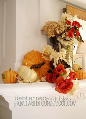
After I ate lunch, I popped the roses into a vase of water and put them into this display:
After I ate lunch, I popped the roses into a vase of water and put them into this display:

I figured they could live there for the weekend, freshening up the display,
and then I'd toss them out the next week. Cheap props, just the way I like 'em!!!
Only, when I came back, they had begun to dry in perfect form....
Only, when I came back, they had begun to dry in perfect form....
so I didn't throw them out.
I wrapped each bunch up in our store's tan tissue paper, and took them home.
They just kept drying, all wrapped up,
I wrapped each bunch up in our store's tan tissue paper, and took them home.
They just kept drying, all wrapped up,
without losing petals or bending or looking forlorn.
That's when I decided to keep them indefinitely - and decorate with them!


I tucked the tissue-wrapped bundles of roses into a burlap market bag on the dresser in my office.
The fading color of the white roses coordinates perfectly with my neutral decor,
(which is why the rusty orange ones don't show in this photo, they are tucked down into the paper)
The fading color of the white roses coordinates perfectly with my neutral decor,
(which is why the rusty orange ones don't show in this photo, they are tucked down into the paper)
and the soft lingering rose scent is a welcome addition to this area near my desk.
I may never throw these out.
I may let them continue to dry out, eventually de-heading them from the stems
I may never throw these out.
I may let them continue to dry out, eventually de-heading them from the stems
and adding them to a bowl of potpourri or layer the inside of a nest with them.
I've added fresh flowers to my decor for years,
letting the blooms dry in place and enhance the decor for weeks afterward:


 Hydrangeas are one of the easiest flowers to let dry 'en scene', as are roses.
Gardenias and Narcissus / Daffodils also dry well.
In August of 2013, my best friend of 37 years passed away.
I created a bouquet for her memorial service from fiery orange roses and lilies,
I've added fresh flowers to my decor for years,
letting the blooms dry in place and enhance the decor for weeks afterward:


Gardenias and Narcissus / Daffodils also dry well.
In August of 2013, my best friend of 37 years passed away.
I created a bouquet for her memorial service from fiery orange roses and lilies,
inspired by her fiery red hair and spirit.

I saved a few of the roses that I didn't put in the arrangement, and I still have them...
the perfectly dried petals nest in a special teacup here in my office.

I saved a few of the roses that I didn't put in the arrangement, and I still have them...
the perfectly dried petals nest in a special teacup here in my office.
Those rose petals mean the world to me, because they are a connection to her.

This isn't just true for REAL flowers, either...
Long ago, I found a bunch of vintage fabric roses at a thrift store - for a song.
Long ago, I found a bunch of vintage fabric roses at a thrift store - for a song.
I cleaned them, then wrapped them up in a bit of vintage sheet music.
I displayed them lying on the table (this one made from a vintage peach-painted door)
I displayed them lying on the table (this one made from a vintage peach-painted door)
and the simplicity of the display was timeless.
Finding beautiful decorative elements isn't about what you spend...
I'm getting a lot of lasting enjoyment out of two simple and cheap bouquets.
It's about the value you coax out of the elements.
Next time you grab flowers at the market,
think about how you can extend their contribution to your decor...
choose flowers that will dry well, and enjoy them from fresh to faded.
choose flowers that will dry well, and enjoy them from fresh to faded.
.
PS: That lampshade in the photo up above?
I'll share its secret in my next post !

PS: That lampshade in the photo up above?
I'll share its secret in my next post !


.JPG)

.JPG)

.JPG)